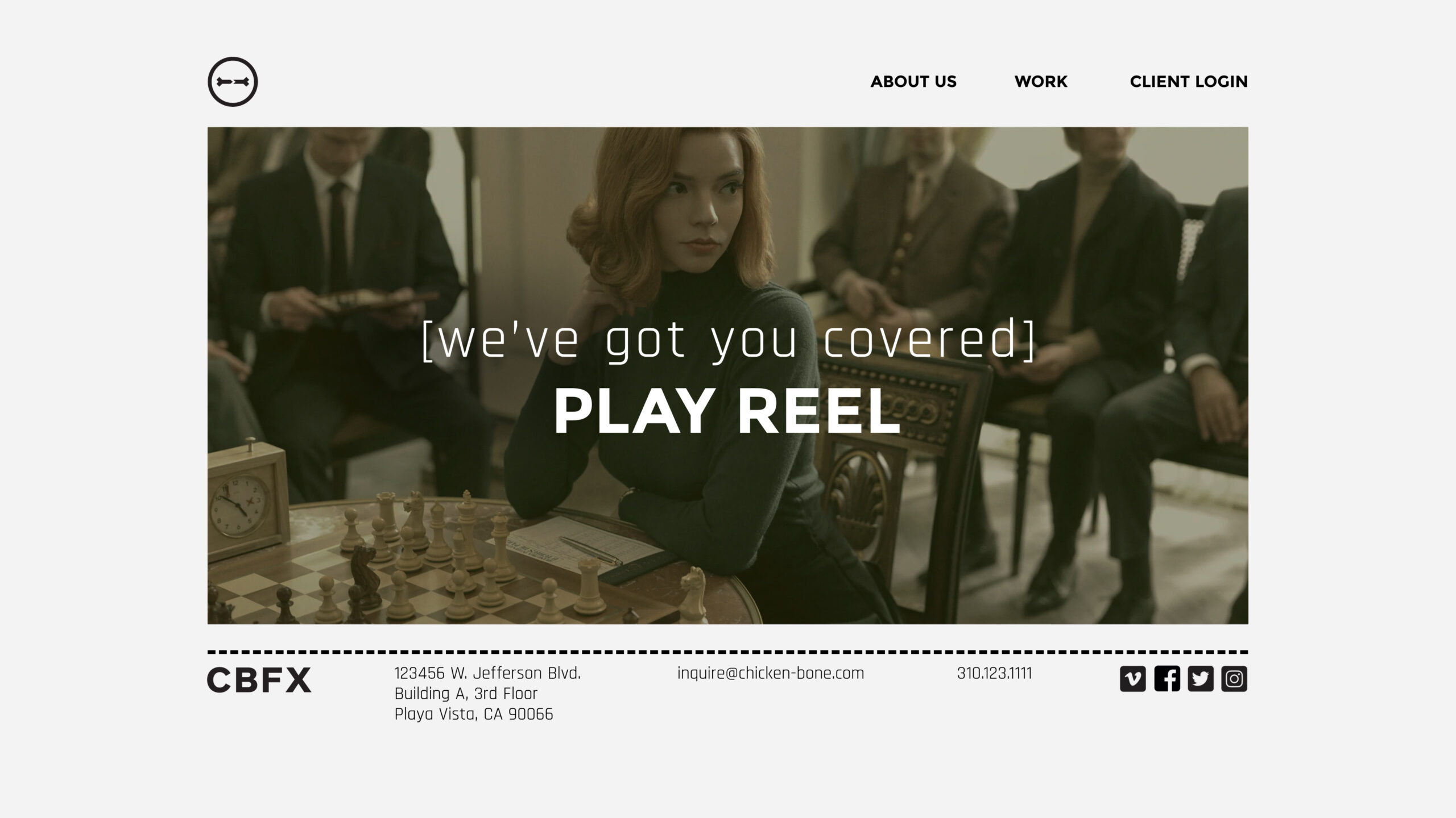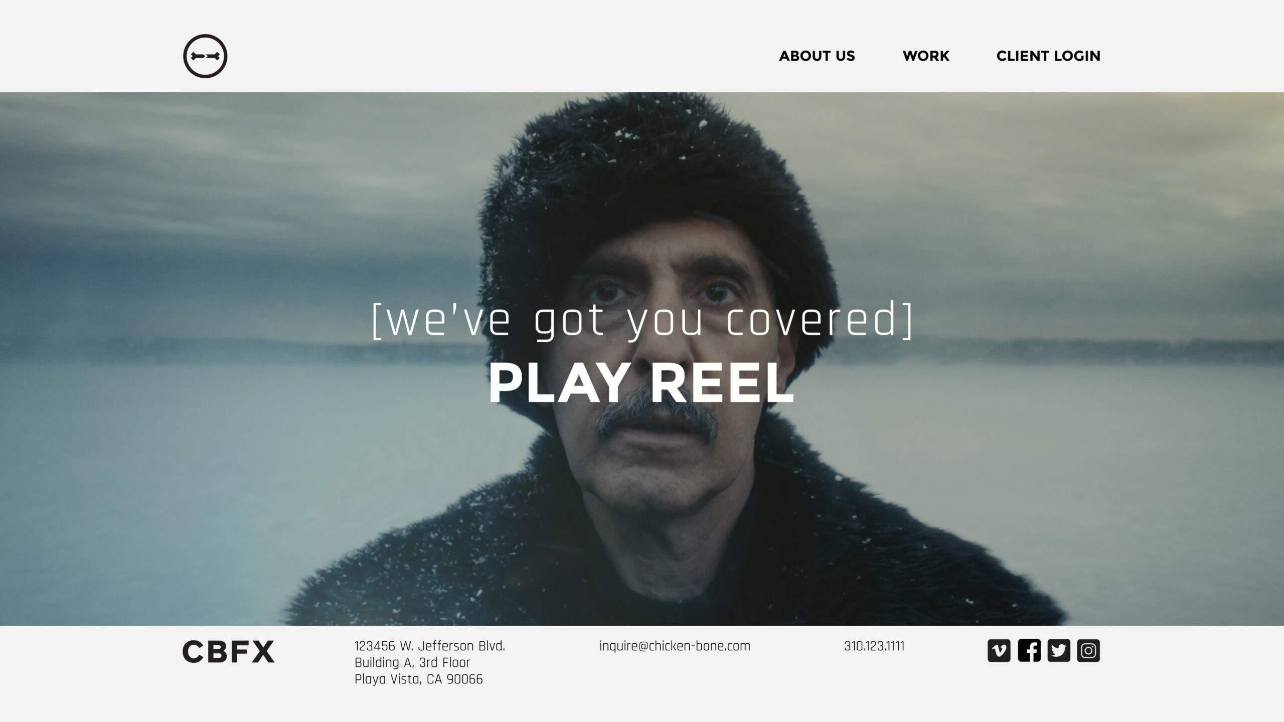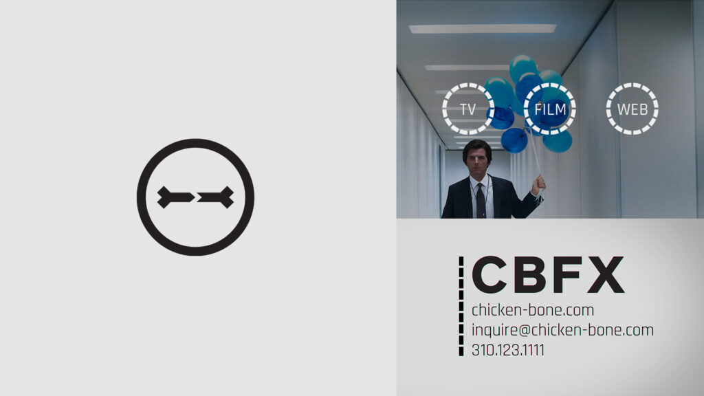
When CBFX first reached out about working together, they had a name, a clipart logo, and a rapidly expanding VFX business built on a track record of doing impeccable work. Johnny, the founder, wanted a logo and a visual ID that could keep pace with the increasing professionalism of his growing company without losing the personal, DIY spirit that was his calling card.
“We need people to understand we are credible… but I’d like there to be a little bit of whimsy, too.”
So, the brief: to build a sophisticated and accessible visual toolkit for use across various mediums and applications: VFX breakdowns, reel bumpers, animated explainers, websites and banner ads, business cards, delivery slates and shipping labels, etc.
For the main logomark, I updated the titular “bone” as a simple, self-assured icon and paired it with a primary font and stroke weights that evoke solidity and staying power.
A monochrome palette and dotted-line motif fill out the look and provide connective tissue visually.